
Printed designs often look different from what you see on a screen. Colors may appear darker, less vibrant, or slightly off, even when the original design hasn’t changed. This happens because screens use light to display color, while printers use ink that absorbs light.
CMYK is the color system created to manage this difference. Understanding how it works ensures printed materials look balanced, consistent, and closer to the intended design, while also reducing errors during production.
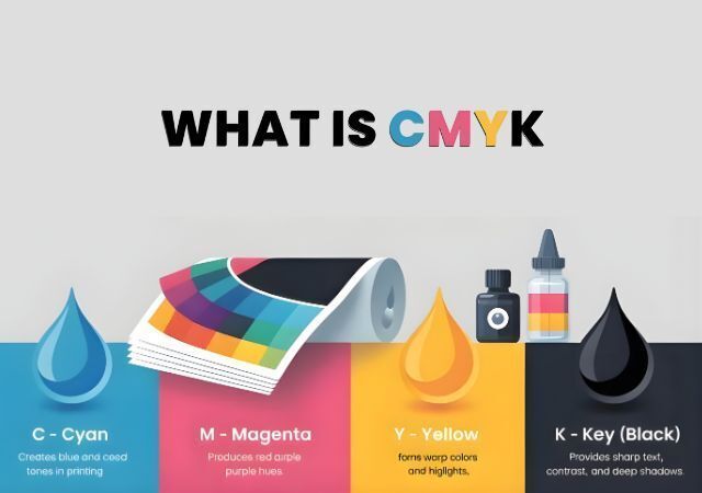
What Is CMYK?
CMYK is a color model specifically for printing on paper, cardboard, packaging, and other physical surfaces. Unlike screens, which use light, printers use ink, and ink behaves differently once applied to a surface.
Printers apply tiny dots of cyan, magenta, yellow, and black in layers. These dots combine to create shades, depth, and details. The more ink applied, the darker the color becomes. Because it “subtracts” light as ink builds up, CMYK is called a subtractive color model.
By using CMYK, designers and printers can predict how colors will appear in the final print, making it easier to produce consistent, professional-looking results.
What Does CMYK Stand For?
CMYK stands for four ink colors used in printing:
C – Cyan
M – Magenta
Y – Yellow
K – Key (Black)
Each ink has a role:
- Cyan, Magenta, Yellow: Combine to create most colors.
- Black (Key): Adds depth, contrast, and fine details.
By adjusting the amounts of each ink, printers can produce a wide range of tones, from soft pastels to bold, vibrant colors. This system has been used for decades because it delivers consistent, repeatable results across multiple print runs.
Why Is CMYK Important for Printing?
Printing doesn’t leave much room for mistakes. If colors are wrong, reprinting can be costly and time-consuming. Using CMYK helps keep colors predictable and consistent.
Colors Print Closer to Expectations
CMYK shows how colors will actually look once ink hits paper, reducing surprises between screen and print.
Ink Coverage Stays Controlled
Proper CMYK balance ensures pages aren’t too heavy or too light with ink, making large print runs look uniform.
Text Remains Sharp and Readable
Using black ink for text prevents small fonts and fine lines from appearing fuzzy or blurred.
Dark Areas Look Clean and Consistent
Dedicated black ink ensures shadows and deep areas have contrast without looking muddy.
CMYK also helps manage ink efficiently, supporting both quality and production costs.
What Does the ‘K’ Stand For?
The “K” in CMYK stands for Key. The key plate carries the most important details, like outlines, text, and shadows. Black ink is used because it provides sharpness and strong contrast.
Using a dedicated black ink instead of mixing other colors ensures fine details stay clear and designs look professional.
Understanding the Mysterious ‘K’ in CMYK
Some people wonder why black isn’t “B.” Using “B” could confuse it with blue, so printers settled on “K” for clarity.
Mixing cyan, magenta, and yellow alone doesn’t produce a true black—it results in a dull brownish shade. The key (black) ink creates deep shadows, rich contrast, and sharp text, making it essential for high-quality print designs.
When to Use CMYK
CMYK should be used whenever a design is intended for physical printing, because ink behaves differently from light.
Business Cards and Stationery
Ensures logos, colors, and small text appear sharp and accurate.
Flyers, Brochures, and Postcards
Maintains consistent colors across multiple pages and copies.
Posters, Banners, and Signage
Controls ink coverage for large prints, keeping colors balanced and readable.
Product Packaging and Labels
Helps maintain brand consistency across different batches and materials.
Books, Magazines, and Catalogs
Supports high-volume printing while keeping text, images, and colors uniform.
Designing in CMYK from the start reduces unexpected color shifts and makes production smoother.
CMYK vs RGB: Why the Difference Matters
CMYK is for print. It uses ink that absorbs light, resulting in muted and realistic colors that appear consistent on paper.
RGB is for screens. It uses light to create color, making designs appear brighter and more vibrant on monitors, phones, or TVs. However, these colors often don’t translate accurately when printed.
CMYK vs RGB Table
Feature | CMYK | RGB |
|---|---|---|
Color Model Type | Ink-based | Light-based |
Stands For | Cyan, Magenta, Yellow, Key (Black) | Red, Green, Blue |
Primary Use | Printing physical materials | Digital screens and displays |
How Colors Are Created | Layering ink | Combining light |
Color Brightness | Muted, realistic | Bright, vibrant |
Color Range | Limited to printable colors | Wider range of visible colors |
Best Used For | Brochures, flyers, packaging, books | Websites, apps, social media, videos |
Output Result | Predictable and consistent in print | Accurate on screens, not in print |
Understanding the difference ensures your designs are created in the correct color mode for their intended output—CMYK for print, RGB for screens.
Conclusion
Printing requires precision, and color makes a big difference in how a design is perceived. Knowing how each ink works, the importance of black, and when to use CMYK ensures clean, consistent results. At ABC Printing Company, this knowledge helps deliver professional, reliable printed materials that match expectations every time.